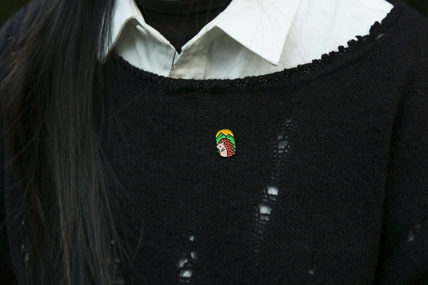
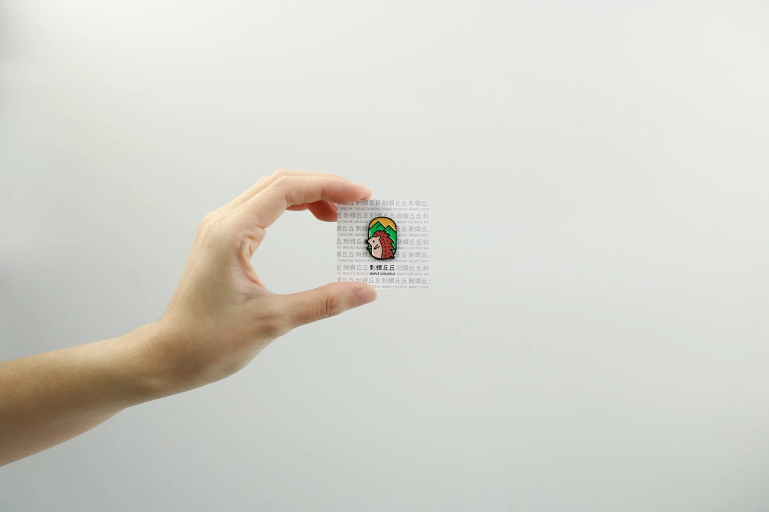
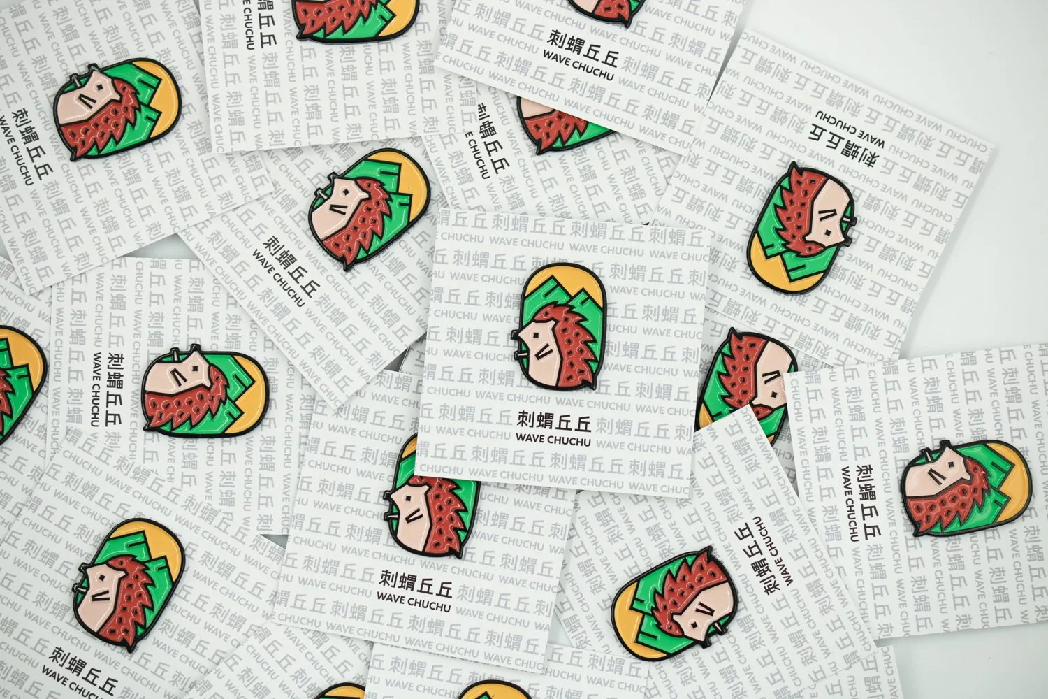
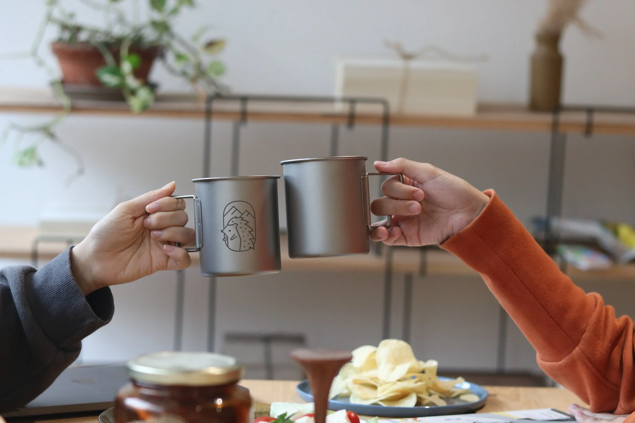
刺蝟丘丘
WAVE CHUCHU
item
企業識別、標準字、電鍍徽章、純鈦杯及商品包裝設計 Corp Identity, typeface, black plated enamel badge, titanium cup, packaging
design
Aki YJ Chen
client
沃草 Watchout
photography
Aki YJ Chen
「刺蝟丘丘」誕生於 2023,一群人在會議室裡討論著如何把台灣的精神重新梳理,最後決定把這個多山的小島概念,還有堅毅又柔軟的台灣人模樣,化為刺蝟和山丘,剛中帶柔,可可愛愛。
整個 logo 以線條為主要元素,把全由直線構成的刺蝟和丘丘置入橢圓形的形狀裡,以犀利和俐落碰撞柔和,為台灣的民主多元刻畫新的視覺形象。
Wave Chuchu was born in 2023, from a series of conversations about how to reimagine the spirit of Taiwan. Inspired by this small yet mountainous island—and by the resilient, gentle strength of its people—the concept takes form as a hedgehog and rolling hills: strong yet soft, protective yet approachable.
The logo is built entirely with clean, straight lines. The hedgehog and hill are placed within an oval shape, where sharpness meets softness and precision meets warmth. Through this balance, Wave Chuchu expresses a new visual language for Taiwan’s democratic values and cultural diversity—one that is firm in principle, yet open and inclusive.