浮室 Soave Plan
item
識別設計、店卡、菜單、貼紙、招牌、牆面標示、門牌 Visual identity, business card, menu, stickers, shop sign, signage and wayfinding
design
Aki YJ Chen
client
浮室 Soave Plan
photography
陳佩芸 Pei Yun Chen
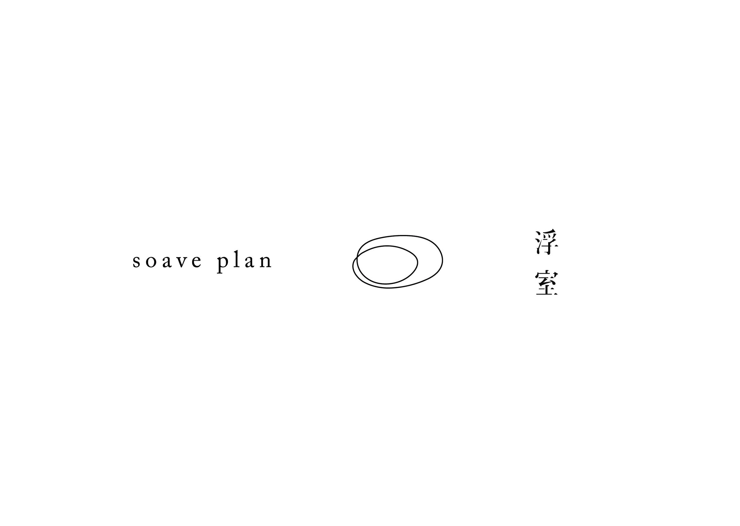
浮室 Soave Plan 想要打造一家在地的花蓮咖啡店,不譁眾取寵不刻意吸引觀光客,營造自在的氣氛,讓店裡的客人坐在自己的位子,但同時也活在自己的專屬空間裡。兩位合夥人很喜歡「浮」這個字的感覺,希望這家店的形象是一種很漂浮、隨性的感覺,店裡的音樂也會是很有空氣感的。所以 logo 和標準字的設計都以「自由自在」和「漂浮」為原則,看起來是亂畫的筆畫,但也是一種不以傳統形式呈現出來的浪漫。
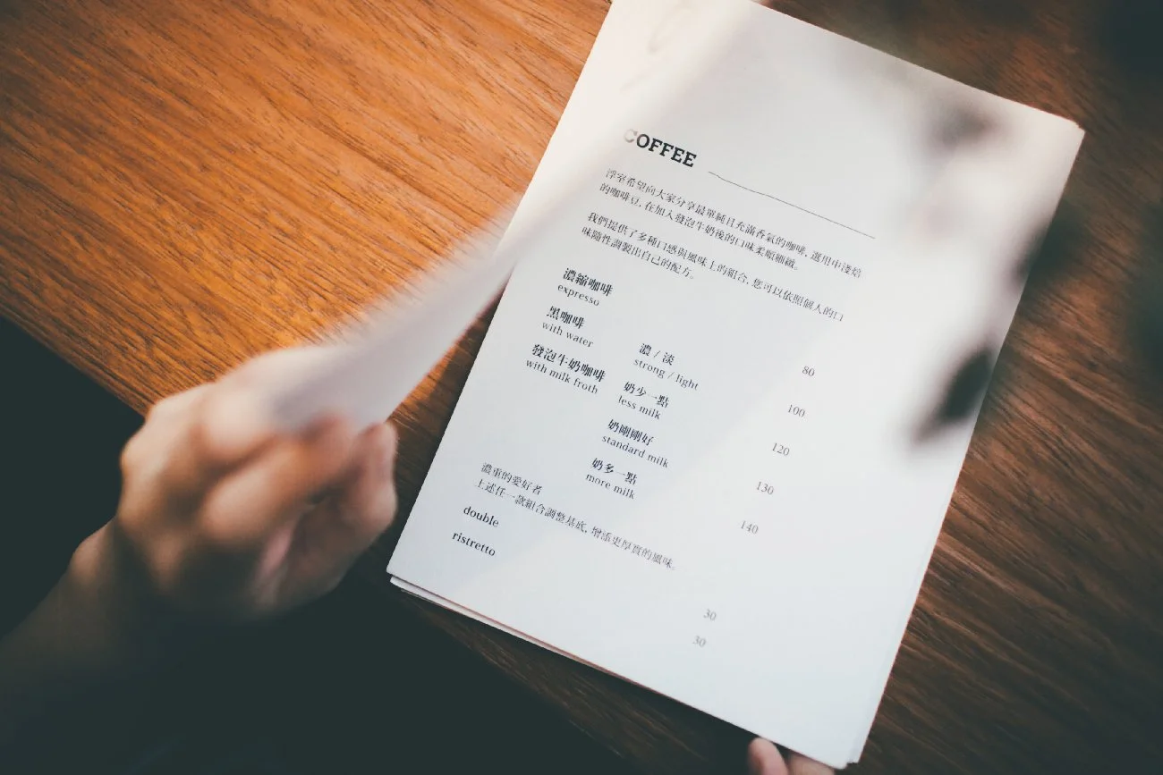
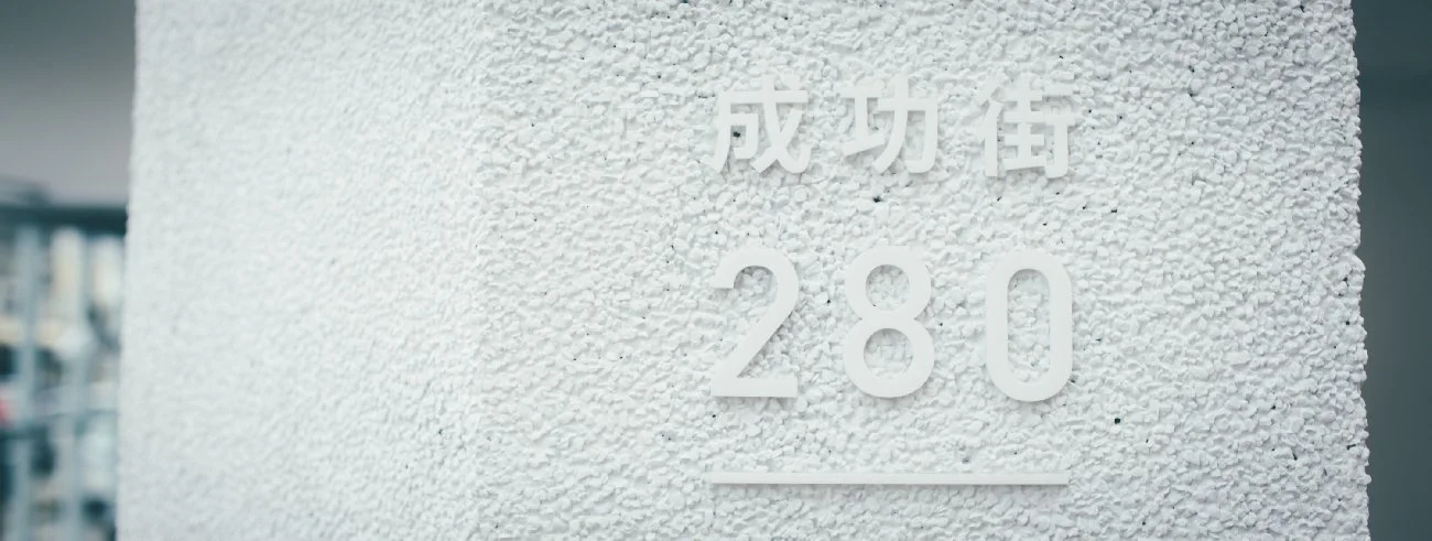
戶外招牌用黑色鋼條做出 logo 筆畫的樣子,夜晚的時候上方的路燈打下來產生的光影很有趣。店卡和菜單採用長瑩紙業的環保再生百代紙(雪白),在店卡上燙 logo 形狀的透明雷射膜,用不同角度觀看產生的顏色變化反覆模擬「浮」的意義。門牌的設計不高調,讓白色壓克力在白色碎石子牆上產生的微弱光影自己說話。
Soave Plan set out to create a local café in Hualien—one that does not seek attention or cater deliberately to tourists. Instead, the space is designed to feel relaxed and unforced, allowing each guest to sit in their own place while inhabiting a personal, self-contained world.
The two founders were drawn to the concept of “floating” , envisioning a brand identity that feels light, drifting, and free. This sensibility extends to the café’s atmosphere, including music with a sense of airiness and openness. Guided by the principles of freedom and fluidity, the logo and custom typography were designed to appear almost casually drawn—loose and spontaneous—yet embodying a quiet romance that departs from conventional forms.
The outdoor signage translates the logo’s strokes into black steel bars. At night, light from the streetlamp above casts shifting shadows, creating an ever-changing visual presence. Business cards and menus are printed on environmentally friendly recycled paper (Baidao, Snow White) by Chang Ying Paper. The business card features a transparent holographic foil stamped in the shape of the logo, producing subtle color shifts when viewed from different angles—an echo of the layered meanings of “floating.”
The address plaque remains understated: white acrylic lettering set against a white gravel wall, allowing gentle light and shadow to speak quietly for the space.