欣和室內規劃設計
Xin He Interior Design
item
企業識別、名片 Visual identity, business card
design
Aki YJ Chen
client
欣和室內規劃設計 Xin He Interior Design
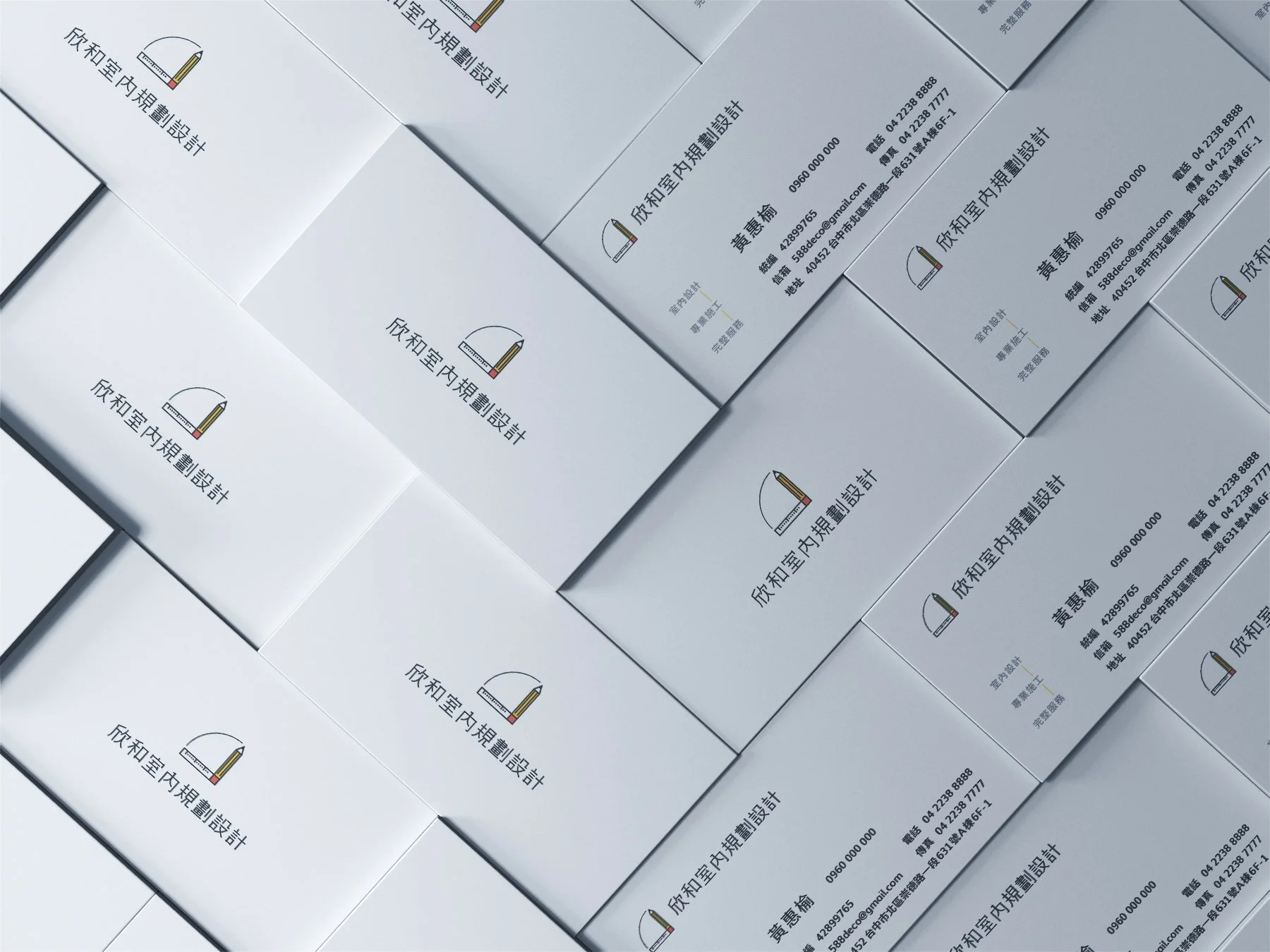
鉛筆 + 尺 + 墨線圖的門
結合規劃(鉛筆)和丈量(尺)的概念,交叉成一個直角,畫出一個九十度的扇形,如同室內設計墨線圖面上開門的方向,也是一種「視野的開啟」。中文字感覺現代且親切,幾處筆畫刻意突出,與平面草圖上面的鉛筆痕跡呼應。
Pencil + Ruler + Ink-Line Door
The visual concept combines planning (represented by the pencil) and measurement (represented by the ruler), intersecting at a right angle to form a ninety-degree fan shape. This geometry echoes the way a door is drawn in architectural and interior design ink-line plans, symbolizing both the act of opening a door and the opening of perspective.
The form suggests a moment of transition—an invitation to enter a new space and expand one’s field of vision.
The Chinese logotype is designed to feel modern yet approachable. Selected strokes are intentionally emphasized, referencing the visible pencil marks found in early design sketches and reinforcing the connection between concept development and spatial planning.